Golden Stitch
Branding and Identity
Golden Stitch is a family-owned embroidery and custom print shop running for over 26 years. The shop is based in Orange County, California, catering to the community to provide custom-made products and uniforms for individuals, schools, and work.
After solely running the business for over 26 years, the owner’s daughter joined the business to help run and manage the store. With their new ideas and plans for restructuring, the owner’s daughter reached out to me to help rebrand the store’s identity by creating their new logo design.
FONTS

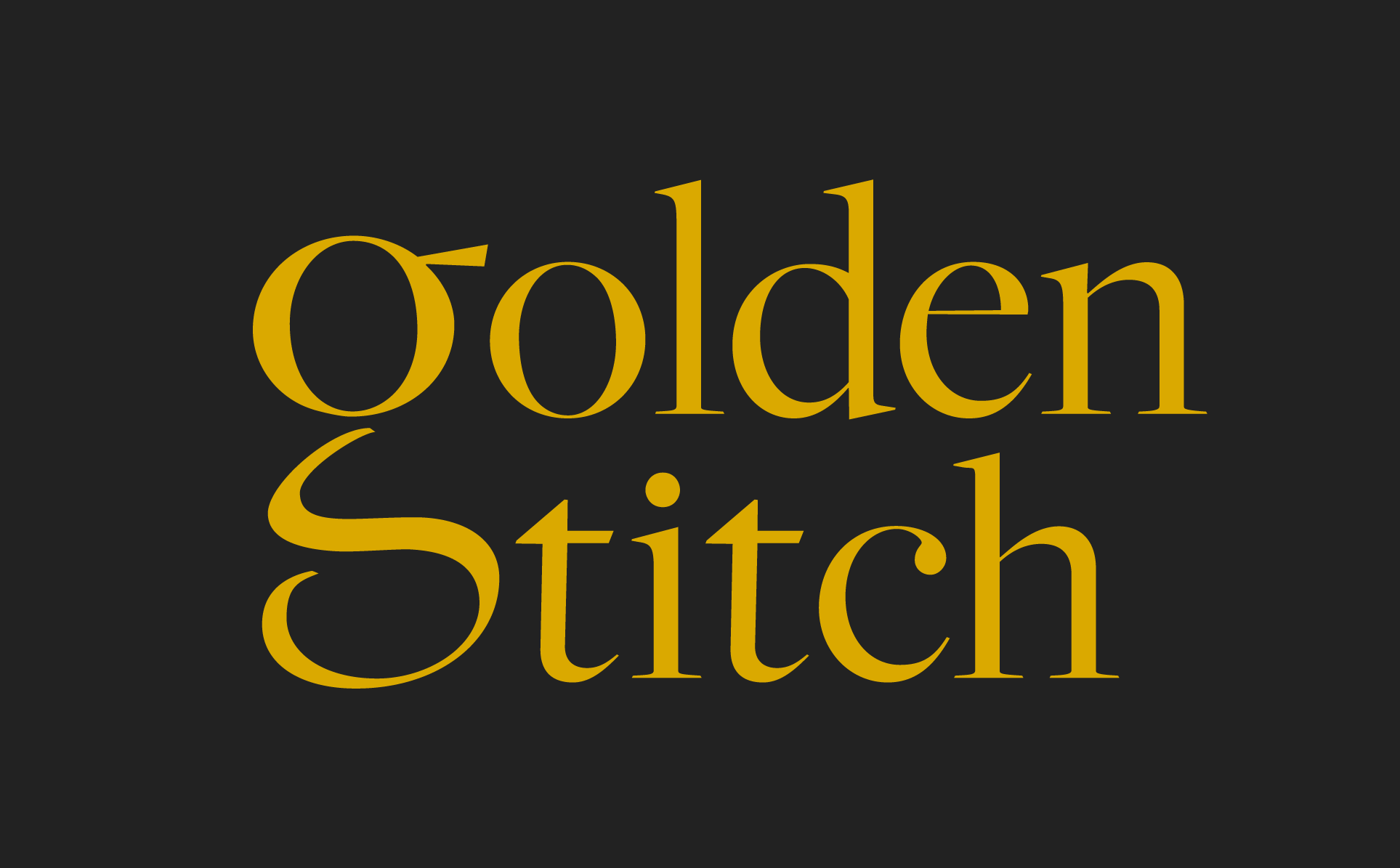
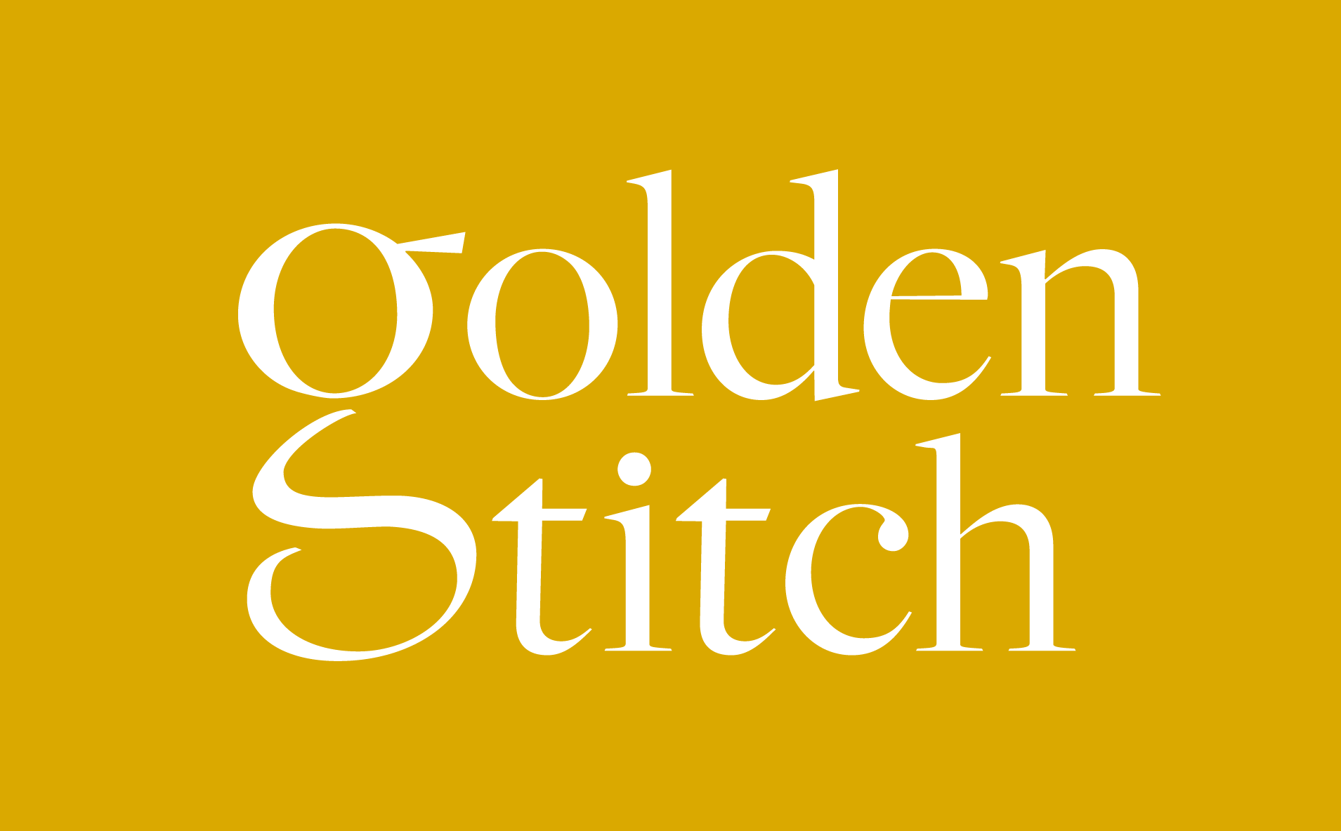
Color Palette


Logo design
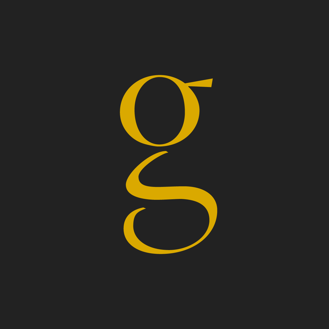
The owner had the idea of utilizing a needle and thread to make up the GS initials but wasn’t sure how the thread would work as the text because they were worried it wouldn’t be thick or legible enough. They were open to any creative design as long as it was easy for people to read. They also specified that they wanted the color palette to be gold and black.
FIRST DRAFT
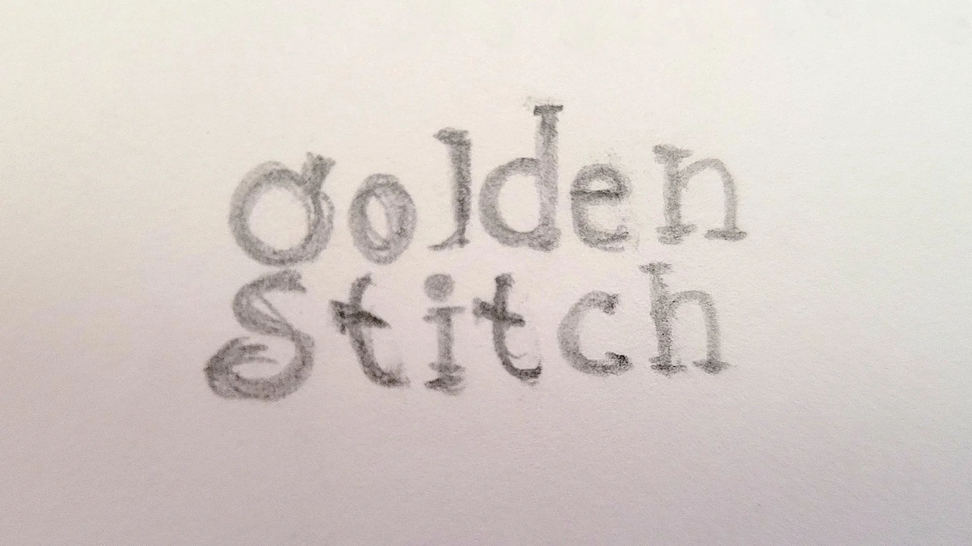
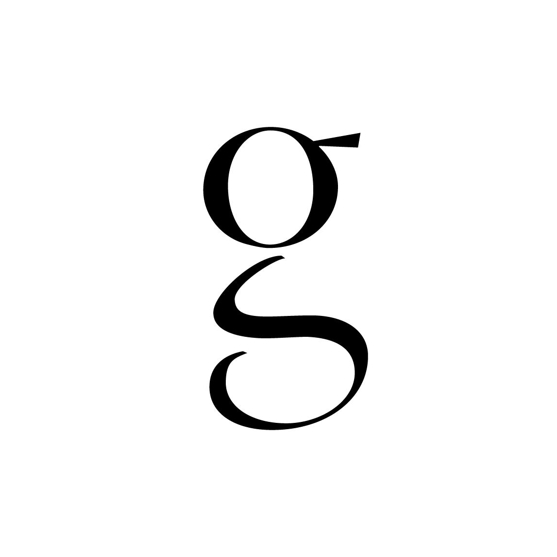
Using the direction from the client, I wanted to make a logo with a calligraphic or handwritten based typeface to depict the thread. The strokes of the calligraphic-based typeface parallel the curves and flows of a piece of thread. I also wanted to incorporate the needle within the text creatively. In the first draft, the G in the logo is used as the thread and the needle is in place of the stem. The stroke approaching the eye of the needle creates a subtle S to represent the company's initials.
Upon presenting the first draft to the owners, they loved how witty the G and S integrate into one another as a needle and thread. However, they decided that they didn’t want the logo to be based solely on embroidery anymore. Since the business was expanding to include vinyl printing, they wanted to shift some focus away from embroidery and have a logo that can be used universally. The owners’ new criterion for the logo was something simple, clean, and eye-catching. Their logo is to be used for their website, business cards, print material, and signage.
Final Logo
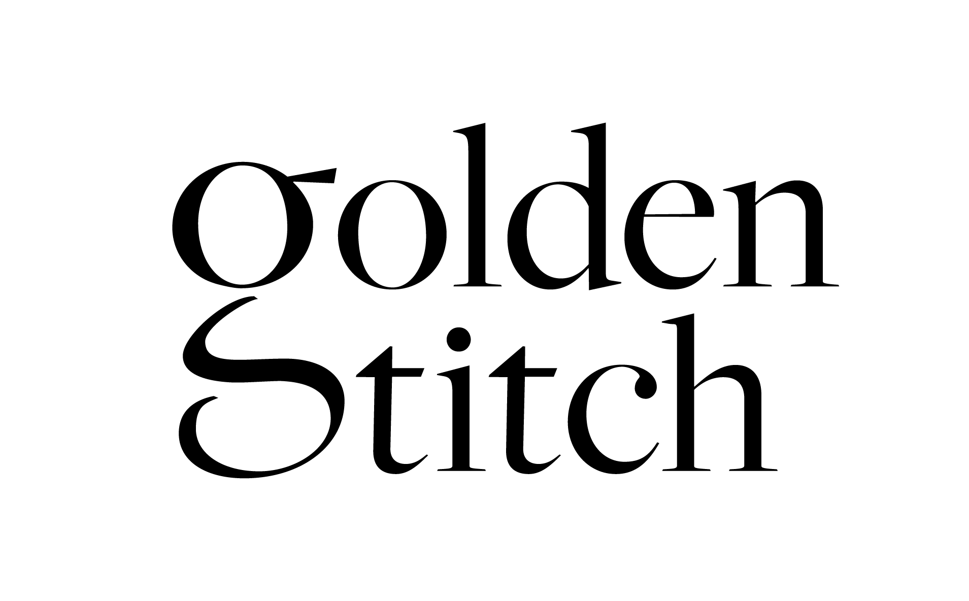
Going back to the drawing board, I had to brainstorm a way to make a simple and eye-catching text-based logo that could be used to represent the shop but goes beyond embroidery. I decided to create the logo with a serif typeface and perform typographic manipulation to add a unique aspect to it. I wanted to incorporate the G and S integration into the new logo similar to how it was implemented in the first draft. I separated the neck of the lowercase G from the top and adjusted the loop to create an S. As a whole, the logo can still be read as a G for Golden, while the lower half can be read as an S in Stitch.
The client enjoyed this version of their logo and immediately started using it in their physical and online presence. This simple yet eye-catching logo was able to catch the eye of many of their customers and followers and they were quick to comment on the transition to the new logo.