BOXIES By Nicc
Branding and Identity
BOXIES By Nicc is an Asian-American, woman-owned small business founded in 2020 during the peak of the COVID-19 pandemic to bring together her passion for creativity and customizable products. It specializes in providing custom-filled assorted "boxies" for various occasions such as holidays and special events. These custom boxies come in numerous handmade assortments, such as chocolate-covered strawberries, tea kits, charcuterie boards, and flowers.
I've had the opportunity to work with BOXIES in bringing the founder's vision to life. I worked closely with her each step of the way in developing her brand identity, logo, design assets, and business cards.
Fonts
Color Palette
Design Assets
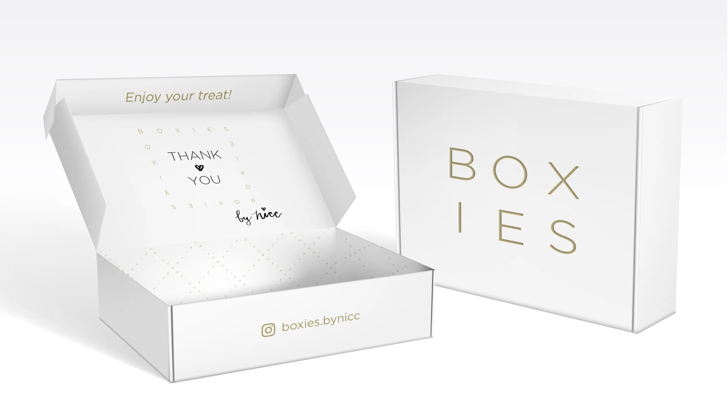
When the founder approached me to help build BOXIES’ brand identity, she showed me a rough sketch of what she wanted the logo to be. The original sketch resulted to be a better fit to be used as a design asset instead of a logo. The logo's structure and composition were ineffective and illegible when scaled down. This design asset is now used as a border element in menus, social media stories, and “Thank You” cards.
Logo design
Utilizing the same criteria as the border design asset, we decided to go with another route for the logo design. We came up with the BOXIES stacked logo, with the B, O, X letters on the top line and the I, E, S letters on the bottom line, representing the structure of a box. The logo is used in social media profiles, hang tags, and packaging purposes.
Business cards
Having the logo design and design element made, the founder wanted me to design simple 2-sided square business cards with gold foil embossing and a Flowcode linking to BOXIES’ Instagram page. With the gold in mind, I researched and sampled various colors to develop a color palette. Because the company sells handmade products like charcuterie boards and tea kits, I wanted to create a color palette representing classiness and sophistication.
I made two versions for the front design and two versions for the back. After days of debating which design to use, the founder ended up choosing the variation with a white background with gold BOXIES text for the front and the larger BOXIES text border design.


